I had a panic attack this morning when I read an article saying that if your website isn’t mobile responsive (meaning, it displays well on mobile devices), you are dead to Google now. While I do tend to get the majority of my book editing and content marketing clients through word-of-mouth, the occasional “I found you on Google” client does happen, and when it does, it’s usually one of my favorite (and, I’m not gonna lie, most lucrative) clients.
Bottom line: in the year 2015, an entrepreneur can’t afford NOT to land high on Google search results, and strategic keyword placement seems to be the SEO strategy of yesteryear.
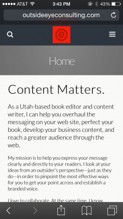
Luckily, in my panic, I ran across this WordPress plug-in review, and within a half hour I had installed a free plug-in called WPtouch that automatically creates a mobile version of your website. You might even be reading this on a mobile device now, and if so, welcome to the new mobile-friendly—albeit quite spartan—version of my site!
As a dedicated autodidact, I’m pretty pleased with myself that I figured out how to responsive-ize my site without having to enlist one of my many talented but pricey developer friends. I’m so grateful to myself for being smart, to the person who wrote this review for being sensible, and to the internet for existing. If not for the internet, I would still be trying to figure out what to do with my pottery degree, twenty years later.
I wanted to share this info with you in case you, too, are an entrepreneur on a bootstrap budget who needs to make your website mobile friendly. The downside to this app? You lose the design of your site in favor of a streamlined, mostly-just-words version of your content. But this is vastly trumped by the major upside: people can find your site!
Enjoy!
